NASA
Email Newsletter
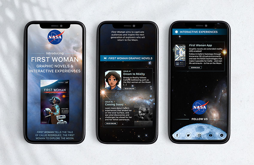
This email newsletter requires me to take NASA as a customer and create a newsletter that informs customers about their events, products, or services. When designing for an existing brand, such as NASA, I must embrace their brand identity by using similar typeface, imagery, colours, and so on to reinforce the brand image. However, I have control over the newsletter’s content, layouts, image placement, and typography.
The arrangement of the newsletter is a challenge in my design approach. Working with a limited width and extended length, such as an email newsletter, was extremely difficult to manage. The need for this specific dimension is that it be informational while also flowing smoothly and being easy to read for everyone. To address this issue, I drew various layout alternatives and chose the most simple and straightforward set up that accommodates all of my photos and text. After that, I formatted the text differently by using different fonts within the same typeface to make the headlines stand out and to put together similar levels of information together so that viewers could easily follow. Shapes like straight lines and boxes also assist to divide different levels of information from one another, giving readers some breathing room.
Everything falls into place when I find the arrangement that works best for my content. It was fascinating to solve a design problem that designers would confront frequently in the real world.
BACK TO HOMEPAGE
 Portfolio