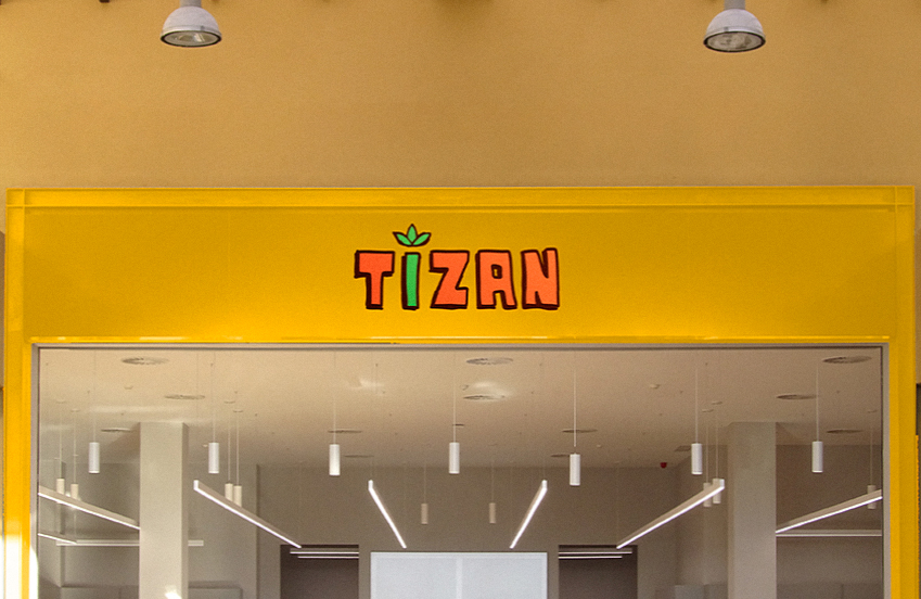
TIZAN
Tea Brand Identity
Tizan is a tea company that I co-founded with my colleague Ngoc-Ni Quach during our second year at Fair Trade. Tizan is a tea company that focuses on robust, fun, and high-quality tea blends, as well as teas in bottles available for purchase in stores and/or vending machines. The website’s goal is to highlight this bold tea brand’s entertaining and unique characteristics in order to attract its target clients, who are youthful and energetic 13-25 year old students. It should also provide the audience with a comprehensive overview of the brand’s product offerings, packaging, physical community service events such as the Trade Fair, and hilarious stories behind its developments.
I’ve had a lot of trouble deciding on an overall theme for the website that should convey a sense of humour while remaining professional enough to display the entire corporate identity. Not only should the website’s look and feel emphasize the brand’s appearance, such as its colour palette, logo, typefaces, graphics, and so on, but the layout and content should also be informative while being short and approachable.
By using a comic book design with blocks around its elements, we were able to create a welcoming and enjoyable design while also maintaining a consistent feel across the website’s sections. Because we are fully aware of our young audience’s impatience, we work hard to simplify the language and focus on the usefulness of images that are structured and repeated throughout the pages to make it easier for them navigate the website.
In the course of creating this website for Tizan with my target audience in mind, I was able to maximize their browsing experiences as well as my own. This responsive website for Tizan has increased my confidence in developing customized websites for nearly any business with a defined brand identity and strategy in mind to bring it as close to the audience as possible.
BACK TO HOMEPAGE
 Portfolio